Monday, November 8, 2010

A complementary relationship between "Word and Image"

   Our college has the great honor to invite Mr. Brian Fies, the Arthur of the comics book “Mom’s Cancer” and the winner of the Eisner for Best Digital Comic in 2005, to be our guest speaker in the class of Design one(class name) on Nov. 2.  The Will Eisner Comic Industry award are like the Oscars of graphic novel; but humility was the only thing that we could find from the awardee.  During his speaking, he showed us a lot of his work and explained how he processed his book.  He gave us so many examples to demonstrate what are the elements to affect him to make his work, and he also stated that both of “words and images” are the essentials to structure a good comic book.
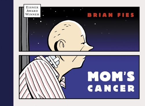


     Fies explained that “Words and images” are able to be the complementary relationship to form a comic book, so there is very important to have a balance development to these two ways.  The imbalance development of “words and images” can be the big issue to affect audiences that do not understand the story of a comic book.  For the example, from the book’s cover of “Mom’s Cancer”, we can find that there are two panels to separate Fies’s mom, and the setting of this border actually can bring a lot of meaning to the picture.  Fies explained that this border has created a feeling of a window pane.  Through the window pane, he and his family could observe and watch his mother.  However, it didn’t help them to understand what her mom was experiencing and how she was feeling.  Because her mom was suffering 2 kinds of cancers at the same time, so he used the top panel to imply that she has a brain tumor, and the lower part was represented that she has a lung cancer.  The two panels also suggest the mood and feeling of his mom to the audiences.  Even though he has projected all ideas from the image, he still needs the words “Mom’s cancer” to tell us what is the theme of his comic book.

Monday, November 1, 2010

“Objectified” – what “Form and content” in today’s design world


“Form and content” both are the essentials for a design.   Especially for industrial design, form is talking about how to present an object and what visual aspect should be appeared to consumers.  Some elements like color, texture and composition will be included in the consideration to compose a design.  However, we cannot work without any subject matter (story) - the content - for a design.  Before we make decision to have a form for an object, we also need enough information to propose the content for its design.


 Inside the documentary movie “Objectified, Alice Rawsthorn, the design critic of the International Herald Tribunedesign editor, says that “design is moving from the culture of tangible of material to increasingly intangible culture”.  Her interpretation of this tendency is quite true.  In the past, analog products like chair, spoon, and fork these kind of objects are according “form follow function” this concept to design them, so people can easily guess what are their function and how to use them.  But the design trend is tended to without relationship between the form and function; for example, iPhone is a typical product of this case.  The form doesn’t help us to understand its function. 


On the other hands, Andrew Blauvelt, the design curator of Walker Art Center, also analyzes 3 phases of modern design. 
1)      first phase : looking at the design and the formal relationship, formal logic of the object, the active form giving, form be get form. 
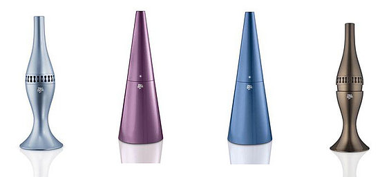
(e.g.: designer Karim Rashid help the company Dirt Devil to make the Kone Vacuum and state that it is so beautiful enough to put it as a display.)


2)      second phase : symbolism and  the content of what you during with.
(e.g. making coffee, using a fork and knife, or the culture of symbolism particular object, those come back to a habit and give form, help give guide to the designers, and see that form should be and how it should look. (e.g. James Dyson’s vacuum, the design is in a very functional manner, form is very expressing symbolism and function, color of the design is not exaggerated because Dyson is not a flamboyance person.)


3)   looking at the technique content of the object, looking at the human and object relationship (e.g. Roomba vacuum, the vacuum is very different, no interaction with human, and no more human interaction in the relationship, the relationship is the room cleaning. )


Last, Blauvelt concluded that as a designer should consider about “the search for form and what form should an object take”, and designers have asked that question and use different


Objectified


“Objectified” is a documentary about the industrial design industry.  Inside the movie, we can find many famous designers to tell about what they have learned in the industrial design field.  From what they say inside the movie, I can understand what attitude we should have before we are being a designer, and what is the important for us as well.

Dieter Rams, the Former Design Director of Braun in Germany, gives many precious aspects that a designer must think about for doing design.  He said that good design should be innovative, make a product useful and understandable.  Also, good design is honest, unobtrusive, long-lived, consistently in every detail, environmentally friendly and little design as possible.  He said that designers are not the fine artists, they cannot work without businesspeople, and this may some designers have confused with and cannot seriously to think about what they should do on their design.  However, he found Apple is the one of the serious company that can make good design in nowadays.  


Jonathan Ive is the Senior VP Industrial Design of Apple Company in US.  When he met the products of “Apple” in the first time, he could feel how is the person of the designer from them.  This so impact me to think more how I can do some good designs and let people to know how sincere when I was doing the design.  He told us the big definition of who you are a designer.  Designer is the way you can look to the world and need to keep constantly to observe to the things around us and think how they are.  This is true that if designers cannot have a good observation, how they can find out the problem before the present their works.

Another French designer who is called Marc Newson also let me think deeper about design.  As a good designer, Newson thinks that he want to do is to be able to have things that don’t exist before. His job is to look into the future but not doing for the existing design.  This is a very positive thought to a good designer and so why he can be successful.

Although there are only these few examples from the movie, we can find that this is really an awesome movie to let us have more thoughts to introspect how to do a good designer.

Monday, October 18, 2010

New home decoration


Besides oxygen and food, water is the essential for maintaining our lives, so we cannot live without water everyday.   Since water tap and its system had been designed, we all can get water easily today.   Thus, the existence of water tap is a great creation to the whole world; we make sure that we can have water as we want.   

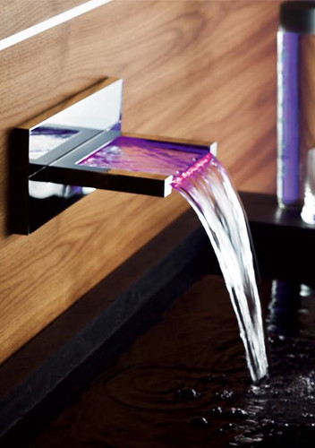
Traditional water taps are very purpose oriented.  They look simple and lack of design.  However, the design of water tap in nowadays absolutely can be an artistic decoration inside our restroom or bathroom.   They are now designed in many forms that we may not consider to make them.   They become aesthetic, elegance and interesting.  For example, the faucet company Hansacanyon of Germany has put a new concept on their design, and it is so considerate of our needs.  Not only want to bring art and unexpected modern home decoration to their customer but their design is so considerate of the water temperature.  When the water temperature is too hot, the faucet will make the water throw out in red color.  When it is too cold, the water’s color will change into blue.  If the water temperature is appropriate for using, the water will be in purple color.  Although this is not a very new design (it already has been sold few years in the markets), I still feel interesting of its design. 

Some company will more concentrated to make a good shape of their faucets. 

Even though their prices are so expensive for buying these kinds of faucets, they still have their market for some people who love to make their home so luxury.

Compare and Contrast


During the days of economic downturn, all trades use all sorts of wiles and methods to stimulate the growth of corporate business achievement.  Like recently, Gap suddenly drastic makeover their decades-old logo without any acknowledgement to public, but they did not get any profit from their change.  In contrast, their share was down 13% year-to-date.  What are the matters to cause this result?  


Gap North America president Marka Hansen stated that they chose this design as it's more contemporary and current.   The attempt on innovation is apparently shown.  However, Gap should not start from removing their classic logo. They may not considerate that their white-on-navy blue logo has deeply impressed on their fans' hearts.  


Today, our fashion is wide variety.  Sharp and brilliant colors are dominant in these years.  Nevertheless, people what they wore in between 70’s and 90’s were more casual and simple than nowadays.  Classic black, navy blue, gray and red were the leading colors to be used on designing clothes in those days.  The white long typeface with a classic Navy background color on the original design of Gap’s logo seems like the symbolic of the old casual wear culture to their old fans.  It companioned their followers to grow up over 20 years, so the logo was already part of their lives.   For the aspect of maintaining a business, Gap is appropriately to do something to open up their markets.  A contemporary logo absolutely will help their image become up-to-date and canvass more young customers.  But now the new design is too simple, it is hard to say there is any design on the typeface. A small Blue square inexplicable put just above on the right hand side of the brand name.  The whole design is totally a child’s play.  It is hard to replace the classic old one and rise their business. 


Now Gap is reused their old logo to put down the angry of old customers.  It may be not a serious matter to harm their business but the designing house Laird & Partners who design this logo to Gap will be the most affected one.


Now Gap is reused their old logo to put down the angry of old customers.  It may be not a serious matter to harm their business but the designing house Laird & Partners who design this logo to Gap will be the most affected one.

Sunday, October 17, 2010

Design as a conversation

When we want to express our thoughts more than just using speech, different kinds of conditions like color, shape, size, smell, sound, textile, brightness, and thickness would be considerate as the medium to be used for helping our expression.  Different kinds of art culture are ensued by this reason, and it also happened in commercial world.  Manufacturers want to allure our appetite of their products, they spend time to their packaging and commercial.  From their advertisement, manufacturers create some images which they are desired to convince the belief from consumers.  Like the Japanese beer “Sapporo”, designer used wine bucket in shape as the package.  It is strongly to tell people how fresh and mellow it is, and it is just packed and sold in market.  The shapely bi-metal can adopt a light and bright silver color as its background.   With a golden star logo put above its brand name, the simple and masculine package is intending to lure men’s craving of trying their beer. 

Besides using packaging, many commercials use exaggerated gimmick to achieve their promotion.  Nintendo, the video game company, overstated their importance for the teenaged fans.  Inside the commercial, all teenagers run crazily to a shop which has monopoly to sell Nintendo new products on the first selling day.  The teenagers continuously keep checking their watches to make sure that they will not miss the time for buying their new Nintendo.  When the time reached, thousands of school kids become unusually strong.  And they seem know how to play “kung fu”, they jump over all the obstacles and run extremely faster than train. After they arrived the shop, their faces all change into the “Mario Brothers”.


This fictitious scene has not brought any disgust to audience.  In contrast, it makes a positive affect to strengthen the good impression to the public.   Companion with the Japan theme song to remind me, even thought the advertisement was taken in Hong Kong, we will not forget Nintendo is a Japanese brand.