Monday, October 18, 2010

New home decoration


Besides oxygen and food, water is the essential for maintaining our lives, so we cannot live without water everyday.   Since water tap and its system had been designed, we all can get water easily today.   Thus, the existence of water tap is a great creation to the whole world; we make sure that we can have water as we want.   

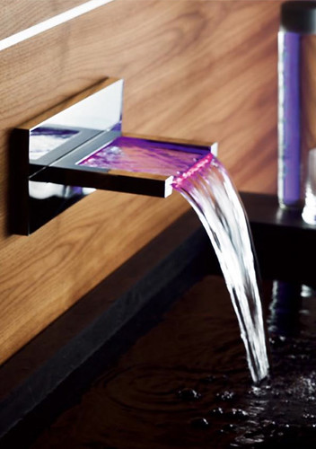
Traditional water taps are very purpose oriented.  They look simple and lack of design.  However, the design of water tap in nowadays absolutely can be an artistic decoration inside our restroom or bathroom.   They are now designed in many forms that we may not consider to make them.   They become aesthetic, elegance and interesting.  For example, the faucet company Hansacanyon of Germany has put a new concept on their design, and it is so considerate of our needs.  Not only want to bring art and unexpected modern home decoration to their customer but their design is so considerate of the water temperature.  When the water temperature is too hot, the faucet will make the water throw out in red color.  When it is too cold, the water’s color will change into blue.  If the water temperature is appropriate for using, the water will be in purple color.  Although this is not a very new design (it already has been sold few years in the markets), I still feel interesting of its design. 

Some company will more concentrated to make a good shape of their faucets. 

Even though their prices are so expensive for buying these kinds of faucets, they still have their market for some people who love to make their home so luxury.

Compare and Contrast


During the days of economic downturn, all trades use all sorts of wiles and methods to stimulate the growth of corporate business achievement.  Like recently, Gap suddenly drastic makeover their decades-old logo without any acknowledgement to public, but they did not get any profit from their change.  In contrast, their share was down 13% year-to-date.  What are the matters to cause this result?  


Gap North America president Marka Hansen stated that they chose this design as it's more contemporary and current.   The attempt on innovation is apparently shown.  However, Gap should not start from removing their classic logo. They may not considerate that their white-on-navy blue logo has deeply impressed on their fans' hearts.  


Today, our fashion is wide variety.  Sharp and brilliant colors are dominant in these years.  Nevertheless, people what they wore in between 70’s and 90’s were more casual and simple than nowadays.  Classic black, navy blue, gray and red were the leading colors to be used on designing clothes in those days.  The white long typeface with a classic Navy background color on the original design of Gap’s logo seems like the symbolic of the old casual wear culture to their old fans.  It companioned their followers to grow up over 20 years, so the logo was already part of their lives.   For the aspect of maintaining a business, Gap is appropriately to do something to open up their markets.  A contemporary logo absolutely will help their image become up-to-date and canvass more young customers.  But now the new design is too simple, it is hard to say there is any design on the typeface. A small Blue square inexplicable put just above on the right hand side of the brand name.  The whole design is totally a child’s play.  It is hard to replace the classic old one and rise their business. 


Now Gap is reused their old logo to put down the angry of old customers.  It may be not a serious matter to harm their business but the designing house Laird & Partners who design this logo to Gap will be the most affected one.


Now Gap is reused their old logo to put down the angry of old customers.  It may be not a serious matter to harm their business but the designing house Laird & Partners who design this logo to Gap will be the most affected one.

Sunday, October 17, 2010

Design as a conversation

When we want to express our thoughts more than just using speech, different kinds of conditions like color, shape, size, smell, sound, textile, brightness, and thickness would be considerate as the medium to be used for helping our expression.  Different kinds of art culture are ensued by this reason, and it also happened in commercial world.  Manufacturers want to allure our appetite of their products, they spend time to their packaging and commercial.  From their advertisement, manufacturers create some images which they are desired to convince the belief from consumers.  Like the Japanese beer “Sapporo”, designer used wine bucket in shape as the package.  It is strongly to tell people how fresh and mellow it is, and it is just packed and sold in market.  The shapely bi-metal can adopt a light and bright silver color as its background.   With a golden star logo put above its brand name, the simple and masculine package is intending to lure men’s craving of trying their beer. 

Besides using packaging, many commercials use exaggerated gimmick to achieve their promotion.  Nintendo, the video game company, overstated their importance for the teenaged fans.  Inside the commercial, all teenagers run crazily to a shop which has monopoly to sell Nintendo new products on the first selling day.  The teenagers continuously keep checking their watches to make sure that they will not miss the time for buying their new Nintendo.  When the time reached, thousands of school kids become unusually strong.  And they seem know how to play “kung fu”, they jump over all the obstacles and run extremely faster than train. After they arrived the shop, their faces all change into the “Mario Brothers”.


This fictitious scene has not brought any disgust to audience.  In contrast, it makes a positive affect to strengthen the good impression to the public.   Companion with the Japan theme song to remind me, even thought the advertisement was taken in Hong Kong, we will not forget Nintendo is a Japanese brand.

Monday, October 11, 2010

Pioneer of printing - Harper's


Harper's magazine is a weekly magazine which covers many general interest like literature, politics, culture, finance, and the arts in nowadays.  However, you may not know the promoters also had made a big contribution of printing skill to the later generations.
 
Harper’s Magazine was founded in 1850.  In those days, industrialism was beginning to be the major force in United States.   The Harper brothers — James, John, Joseph, Wesley, and Fletcher actually were the innovators and pioneers in the printing industry.  They were the first to utilize steam as the motive power in pressroom, and they also the forerunner to promote the art of electroplating.  During the 1840s, the Harper brothers used a new printing method to print out a bible which called “Harper’s Illuminated and New Pictorial Bible.  With pretty illustration and delicate hand-sewn binding, the bible had contributed a very significant achievement to affect Graphic design and book production at that time.  For preparing to print the bible, Joseph A. Adam invented an electrotyping process.  This involved pressing the wood engraving into wax to make a mold, which was dusted with graphite to make it electroconductive.  Then an electrodeposit of metal was made in the mold.  The printing method enabled the publishing of the bible up to fifty thousand copies installments.  


Harper brothers started to have their book publishing house which named “Harper & Brothers”.  As Fletcher Harper said that it was “a tender to their business”, they saw bright-colored visions of the future of American journalism and American literature.  This should be the demand from the society, so they understood that it was a good time to start their business of publishing a periodical.   In 1850, their first magazine “ Harper’s New Monthly Magazine was launched.   The first press was 7,500 copies, and they were sold out immediately.  The circulation was up to 50,000 issues after six months.  The shortage of skillful journalists, it caused the tendence to reprint English novels on their publication for fulfilling the majority of literate American readers.   The offshoot “Harper’s Weekly” orientated to be published as a weekly newsmagazine in 1857, Harper's Bazar for woman in 1867, and Harper's young People for the young audience in 1879. 

At that moment, Harper brothers already employed art staffs to create the woodcut illustration for their publishing.  Thomas Nast was the conspicuous one.  He was started to be draw for Harper’s magazine in 1862 and remained with the Harper’s Weekly for more than 20 years.  Nast was a very awesome caricaturist.  He was talented to use animals to satirize the political parties.  The most familiar character should be Uncle Sam. 


Stone Soup


About “Stone Soup” this story, I heard it long time ago when I was a little child in Hong Kong.  The memory is kind of still in my head but cannot remember what is the whole story.  This is so amazing that Dr. Housefield brought this concept to the lesson and asked us to do it during the class.  Through the experience of making the work with my team members, I found it should be a good training to make us have a calm and quickly responsive mind when facing a pile of chaos.   Just like the plot of the story, everyone brought different “ingredient” to the “soup and saw how the soup would become afterward. 


Stepped out the big lecture hall and sat on a carpet of green grass, my team members and me started to take out what we had brought from our bags.  Most of the stuffs that appeared in my eyes were art materials like colored papers, color pens, white glue, and paints, etc. It made me have a doubt that did I bring the wrong things?  I was the only one who looked like a garbage collector to bring the recycle stuffs to the team.  When we were watching those stuffs, we started our brainstorming of how to use the paper plates, wire, wool, stickers with “moving eyeball”, and my packing boxes.  I could not remember who voiced out the idea first about to make a robot first, and he has named Francois.  He is shy and artistic, and he is waiting for a dating who will never show up.  Surprisingly, the members had a very quick response to my packaging.  They made two of boxes became Francois’s torso and used an egg package to be his eyes.  Someone twisted a wire into a pair of glasses and stuck a pair of the moving eyeball on his eyes.  Branches were his arms and legs, and we also help him to dress up with the colored papers.  Within an hour only, Francois already had his own clothes and shoes.  At the end, we also gave him a pretty top hat and put it above his paper plate face. 


It was a very special experience to me, because I had found something about myself through the event.  Compared with the American, they more dare to try something, so they have no doubt when doing things and don’t need to spend too much time for thinking.  This is a good mirror to me for improving my flaw.  After we visited around for other team’s masterpieces, we took a photo with Francois.  Although we spent an hour for a piece, we still need to say goodbye and dismantled it before we left.


Creativity from without


The famous masterpiece which is called 'Cold Dark Matter: an Exploded View' is produced by the Turner prize nominated contemporary artist Cornelia Ann Parker.  The pieces of charred wood & objects hung on wires from the ceiling around a central, for reappearing the explosion process that had happened in Parker’s garden shed and had blown apart at her request by the British Army.  The suspended fragments with a light in the center make the shadows of the wood dramatically cast on the walls of the exhibition hall, and this creates a feeling that the explosion is on-going.


Another Parker’s dramatic work which is comprised by charred wood is called 
Heart of Darkness”.   She collected the materials from a fierce fire that happened in Florida in 2004.  The artist alludes a distress of original landscape by suspending and formalizing the black charred wood from the high ceiling of the exhibition hall.  An extraordinary 3D appearance signally strengthens the sorrow of the piece.


Neither From Nor Towards, 1992
Using the residual bricks of a house wore away on the cliffs of Dover, Parker repeated a unique expression by hanging the bricks.  She arranged the bricks in a simple house shape and reverted them into its original appearance that they are no longer to be the part of a house.

 
Alter Ego (poor coffee, posh coffee) 


One of the Parker's permanent display "Breathless" is showing in London's Victoria and Albert Museum which is consisting of 54 crushed and flattened brass instruments.


From Cornelia Ann Parker's pieces, she employed many kinds of methods for expressing her originally designs of her art works: suspending, exploding, crushing, and stretching objects all can be found.  Parker masters how to transform materials and utilize spaces to compose the new creative work, and it is familiar to the world. 


Monday, October 4, 2010

Who caused me like design??

          I have always liked to draw, and even to made sculptures and handcrafts.  In elementary school and middle school, I always did exceptionally well in my art classes, and winning prizes in drawing competitions in school. Of course, my parents influenced and helped me a lot too. My mother was fantastic artist and my father was a garment manufacturer.  He designed his own products for his wholesaling business. He taught me how to design clothes according to color theory and patterns, and he taught me how to illustrate clothing.  It was then when my interest in art and design really deepened because I realized art and design could actually be applied to things people use rather than just drawing pictures.
Before I moved to California, I had worked as an assistant designer, helping designing accessories and handbag items, so I needed to handle many graphic works and material sourcing.  I felt proud of my material sourcing in the past because the designers actually acknowledged my selection for their innovation. In addition, I had freelanced for a small advertising company for some graphic design works.  One of my masterpieces that I designed for a client of this company was a movable calendar.   This paper calendar was also a pen holder and could be moved accurately to the proper position for reading the date and was originally designed for a temporary promotional use. However, the client was so satisfied with my product their company continued to order them and I gained more freelance job in this company.  That period made me feel very successful in graphic design, and when I immigrated to America, I wanted to continue studying Graphic Design.

Design in Society


From the beginning of the human history, men inhere creativity.  We are inborn designers.  We know how to build and use tools  for our living.   We are different from wild animals and insects who are built with instincts to anticipate weather and disaster.  However, our wisdom can override this shortcoming.   We use our wisdom to solve problems so we don’t live like other wild animals.  Otherwise, we may need to migrate seasonally as the bird of passage to avoid the cold winter. 


Apart from invention and creativity, we also know how to improve our design.  A good design does not only improve an outlook of a product but also makes our lives easier.  In fact, it should be the fundamental objective of designing a product.  The term “user friendly” is always being emphasized when a product is designed.  For example, some countries use smart card to replace real money for their daily lives.  In Hong Kong, the whole transportation system is built on top of the same smart card system.  People don’t need to buy tickets every time.  At the same time, this smart card can be used to pay in supermarket and convenient stores.   Some building also has a system to recognize the smart card and stop at the floor where you live.  What an awesome design it is!


Car manufacturers keep on thinking how to bring drivers a convenient life.  The “Smart Key system” which was invented by Toyota is started being used by other manufacturers.  This keyless entry system allows a driver to start the engine with a single press.  The automatic parking system may be the next popular function in the near future.  


To make your driving experience more pleasant and enjoyable, an automatic transmission system- Steptronic- makes shifting gears as dynamic and sporting as it is with a manual transmission.


All of above are only examples.  They frankly tell us "design" makes our own world lovely and fun!

Ballet

When I was a child, I liked watching ballet from some TV programs.  The performers wore in the ballet dancing dresses, and their light chiffons and laces made me fascinated ballet in those days.  The unique dancing steps are full of elegance.  This should be the most feminine dance that can cause many girls dream to be a ballet dancer.   Every time when I saw the dancers point their feet and turn around, the glamour attracted me to draw their posts down on my papers.  First, I liked to start from drawing the ballet shoes since it was too interesting to a small child why the whole body can only be supported by those small tiptoes.  The repeated and repeated drawing of the ballet dancers, I started to figure out how to draw human in an equal shape.  This made me love to sketch human body until now.  Also, it caused me to think that the conformation of human is the most beautiful thing in the world.  And then I tried to design different dresses and clothes to my drawing figures, I put different styles of dresses on the figures and drew many decorations on them.  At the same time, the impact to me why I liked designing clothes was happened at that time.  I went to study fashion design after I completed my high school.  Even though I have changed to study in Graphic design, I still like to draw something like fashion illustration.  Besides the affect from my parents, one of the true story why I love to design should be started from I watched ballet.