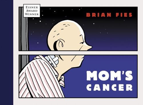
Our college has the great honor to invite Mr. Brian Fies, the Arthur of the comics book “Mom’s Cancer” and the winner of the Eisner for Best Digital Comic in 2005, to be our guest speaker in the class of Design one(class name) on Nov. 2. The Will Eisner Comic Industry award are like the Oscars of graphic novel; but humility was the only thing that we could find from the awardee. During his speaking, he showed us a lot of his work and explained how he processed his book. He gave us so many examples to demonstrate what are the elements to affect him to make his work, and he also stated that both of “words and images” are the essentials to structure a good comic book.
Fies explained that “Words and images” are able to be the complementary relationship to form a comic book, so there is very important to have a balance development to these two ways. The imbalance development of “words and images” can be the big issue to affect audiences that do not understand the story of a comic book. For the example, from the book’s cover of “Mom’s Cancer”, we can find that there are two panels to separate Fies’s mom, and the setting of this border actually can bring a lot of meaning to the picture. Fies explained that this border has created a feeling of a window pane. Through the window pane, he and his family could observe and watch his mother. However, it didn’t help them to understand what her mom was experiencing and how she was feeling. Because her mom was suffering 2 kinds of cancers at the same time, so he used the top panel to imply that she has a brain tumor, and the lower part was represented that she has a lung cancer. The two panels also suggest the mood and feeling of his mom to the audiences. Even though he has projected all ideas from the image, he still needs the words “Mom’s cancer” to tell us what is the theme of his comic book.

No comments:
Post a Comment